Generic widget customization
The user can simply drag and drop the choice of widget on the view editor canvas. The widget then appears on the canvas. The widget customization depends on the widget type. see the next pages for details. Typical customization in addition to customizable elements are:
-
Size of the widget: Adjust the widget height and width of the widget based on information it needs to show. Height and width can be adjusted by selecting the icon at right bottom corner. Note that widgets are not automatically resizable. It must be verified that all information is visible or not after launching the application and adjust the height and width of the widget.
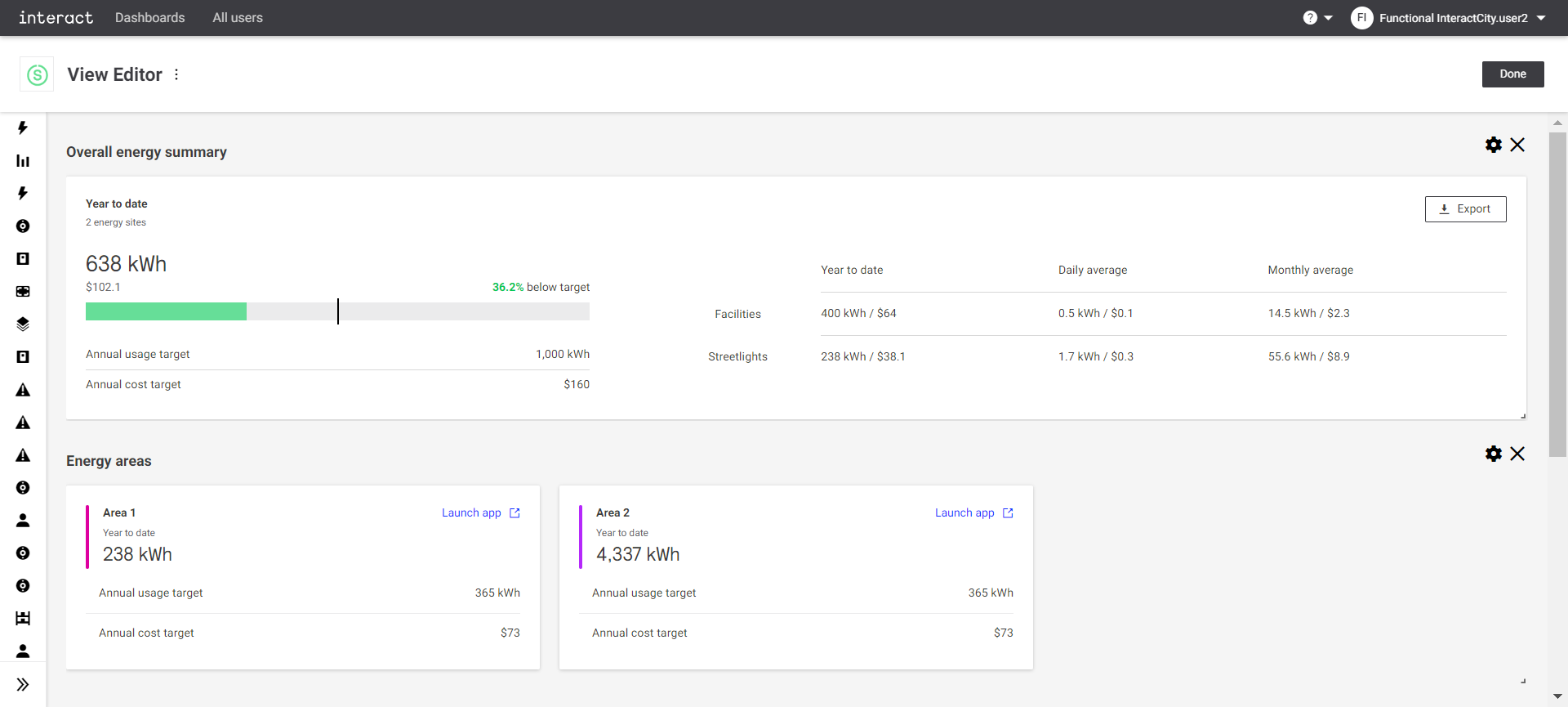 View editor overall energy summary
 -
Position on the canvas: Widgets position on the canvas can be changed as per user requirements. The widget by can be selected by a mouse and moved to the desired position.
-
Hide and show the widget icon: It is configureable to show or hide the icon of the widget in the application. If the show icon property is selected, the widget icon appears as part of the widget in the application.
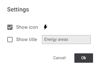 Settings
 -
Title of the widget: Every widget has a title. It is customizable. Click the setting button of the widget and a setting dialog appears. The title of the widget can be updated.
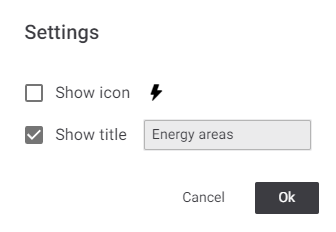 Settings
 -
Remove widget from canvas: Click the
 button on top-right corner to remove widget from the canvas at any time.